
Indoor signs

6/28/2019
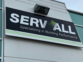
We have all passed by signs that were made too small to read from the distance they are viewed. If your sign cannot be seen from a certain distance, what good will the sign do for your business? Ensuring your sign has high color contrast and the letters are tall enough to be easily read from distances will ensure your potential clients can find your location or parking area, see any offerings your business may have, or learn about potential sales or specials your business may be offering.
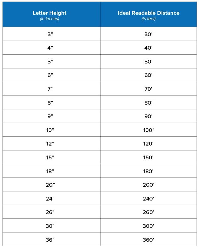
The chart below lists letter heights for your sign along with the distance for best impact and the maximum readable distance for the corresponding letter heights.
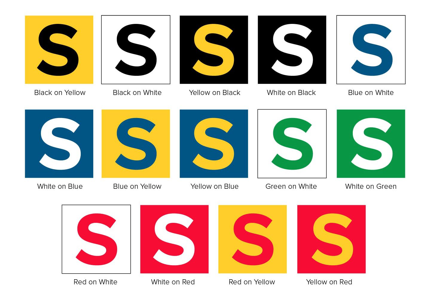
Your sign should also have high contrast colors that improve visibility and legibility. The chart below shows the best color contrasts for your sign.
Have questions about letter height or contrasting colors for your sign? Reach out to our graphics department at graphics@image360kcm.com and we will be happy to help.